TechArs
Responsive Web Desing
TechArs is a responsive website designed to create a better user experience while learning art subjects.
By understanding the users, I have designed a website that is easy to use, friendly and that wont make the students give up. The goal is to make a great user experience and to offer courses and tutorials of a wide variety of art topics, videos that are easy to follow, a grade and quiz system so the users feel their progress and lots of details that make this website stand out.
Project overview
The main problem that I want to solve by designing this website is that the competitors don´t offer a wide variety of topics related to art. Even though there are plenty of web sites dedicated to online courses and tutorials, most of them stand in the basics, such as drawing and painting, while there´s a lot of subjects that users want to learn.
Also, there is a lack of user centered designs, and one of the main pain points is that those websites are hard to follow, with lots of unclassified videos and undefined user flow.
Based in these problems, the goal is to create a responsive design, user friendly, centered in the courses and the tools dedicated to the users learning. By giving the users a motivating product, they wont give up and will use the website as their main study tool. Accessibility is also the pillar of this design, no matter the users capabilities, everybody should be able to use the site in every device.
As the main UX designer of this responsive website, I followed all the steps in the designing process. First, thinking of the problem that I want to solve by creating this website and the goals that I will achieve, related with the potential users of the product, their behaviors and feelings, their pain points and how I may offer a user friendly experience to them. By conducting users interviews and competitive audit, the problem, the goal and the users are better defined and I am ready to create the wireframes (paper and digital) and low fidelity prototypes to perform the usability studies, so I get real users feedback while they interact with the product and the improvement that it may need before creating mockups and hi fidelity prototypes.
User research
I conducted user interviews and built empathy maps to get to know better the target user, pain points and needs. The group identified was adults, working or students, passionate about art, with different studies/job level.
I found out that many users would love to have access to several art tutorials where they can learn more, but also they want to take it seriously so they need some support and variety. Also, the users use to be very busy, so offer them a quick and easy navigation is a must. Many of them would like to have free access to the courses without preventing them of high quality learning. The interviews also revealed that users give up if they feel like they are not progressing.
The main pain point found are:
-Progress: Users give up when there´s no visible progress in their work.
-Variety:Users need a wide variety of tutorials that are structured in the site.
-Navigation: User centered design needed so the users can navigate easy and quickly.
With all the information of the user research, I defined the persona that I am designing for, and it allowed me to get rid of biases while designing and have a better understanding on the users of this website.
Starting the desing
The first step that I took to start designing, was to create a sitemap so the navigation flow across screens will be easier to the user. The navigation is structured in categories and subcategories so the user can find the information that is looking for easily. As the courses and tutorials are classified by topic, each of them has its own clear screen.
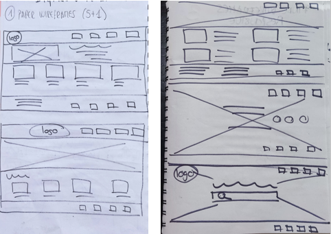
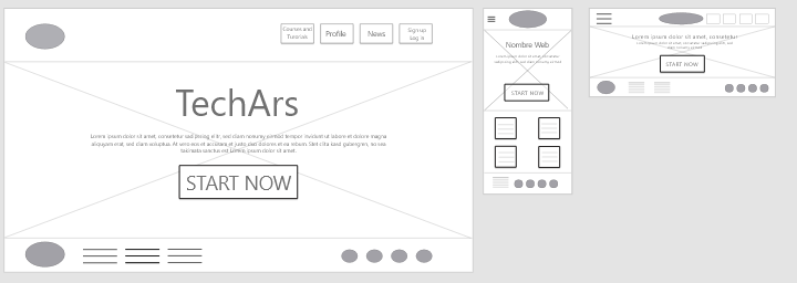
After the structure and hierarchy of the whole site is defined, I continued by sketching paper wireframes with the information and features that I want to display, such as navigation bar, logo, hero image and call to action buttons. As I am designing a responsive website, I also created the paper wireframes to define the look of the website in mobile version.
By drawing the paper wireframes I understood the importance of hierarchy and containers while designing to make the space clear and focus user´s attention on the product. Also I focused in the categories and subcategories, with labels and images so the navigation flow will be easier.


With paper wireframes, I decided which screen suited better to the user flow that I want to test later in the usability study. That´s why I designed a home screen with a hero image and a call to action button below the information about the site. The navigation site stays at the top, as well as the logo.
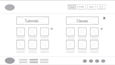
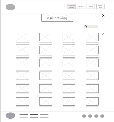
To follow up the user flow, the next screen allows the user to choose between tutorials and courses in the same screen. These categories are displayed as headings, and below them, every topic related to them, also with images and their label. The next screen shows all the videos related to the category chosen with a quick description. After clicking on the video, a new screen displays the content and a note board or sticky notes surface, so the user can take notes while watching the video. The last screen shows the users progress and related features that may take, according to one of the main pain points of the user research.


Refining the design
I conducted and unmoderated usability study with 5 participants testing the lo-fi prototype in Adobe XD. Even though most of them found the navigation easy to follow, I found out a few crucial improvements.
Findings:
-Options: Participants said that too many option to choose between may make the flow overwhelming.
-Search: Participants asked for a search bar wisely placed as an option to navigate.
After the findings on the usability study, I added a search bar first to help the user choose what is looking for. Also the filter option has been removed as it made no sense, and a return arrow shows the way back better than the close icon. Also I left less negative space so is easier to see and read the subjects. Users have both options, search and filter, and also the subjects have been reduced to the most important topics.
The UI is based on artistic concepts, with images that reflects every subject and creates a relaxed environment.
Accessibility considerations: -Clear headings of categories and subcategories to establish hierarchy. -Closed caption and video features so everyone may enjoy the videos no matter their personal circumstances. -Every subject has its own image, alt. text and label so is functional in screen readers.


Conclusions.
I want to conduct one more usability study with the high fidelity prototype to learn if the changes of the first one and the user interface are really working with real users. Also it will be a great step to take and improve accessibility.
I would also love to make a new user research centered in professionals that may want to use this platform to work and teaching on the website. I am exploring the idea of making a kids version of the website, centered on the youngest users.
During the desing process of this responsive website, I learned how to get rid of my own biases and stay focused in the users to give them a better experience. Also, I learned how small changes and tools may make the website more successful among the competitors.
I really enjoyed the time spent developing this desing, learning new design concepts and approches to information architecture and resizing depending on the device. Also using Adobe XD gave me new skills with desing tools and I´m thrilled with all the creative oportunities that this knowledge has brought me.
Thank you for your time and see you on the next project!


