TEAyudo
App and Responsive Website
TEAyudo is a mobile app and responsive design dedicated to compile all the information and resources about the Autism Spectrum Disorder (ASD in English, TEA in Spanish)
This case study is based in Spain due to the complexity of the data, but the intention is that this product may be extended to any country.
The main concept of this product is to help users to find all the information and resources that they will need after an ASD diagnose, all in the same place and with constant support, so they find a little bit of light in this complex path.
Project overview
This product has been created to help the users find and get access easily and in the same place to all the information related to ASD and the steps they will have to follow after an ASD diagnose.
The primary target users are parents of children diagnosed with ASD, teachers and professionals willing to learn or use resources related to this condition.
The main problem that I want to solve is the lack of information about ASD that our society still have, and that is why, when a kid is diagnosed with autism , parents and teachers often feel lost, they don´t know where to start, how the bureaucratic process works or how to help the children.
The goal of this project is to create a single space that collects ALL the crucial information about ASD. Assuming the diagnose is already a tough road, this product may do the whole process a little bit easier in a supportive environment.
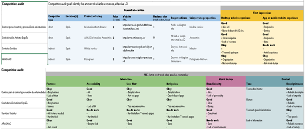
As the main UX designer of the app and responsive website, I followed all the steps in the designing process. First, thinking of the problem that I want to solve by creating this design and the goals that I will achieve, related with the potential users of the product, their behaviors and feelings, their pain points and how I may offer a user friendly experience to them. By conducting user interviews and competitive audit, the initial assumptions have been confirmed, so the problem and the goal are better defined.
User research
I conducted interviews and created empathy maps to understand the users I’m designing for and their needs.
The group identified was parents of children diagnosed ASD and teachers with this type of student that are having issues to find information of the spectrum and would love to have an easier path.
As expected, it was hard for them to navigate through tons of websites with different resources, and above all, the bureaucratic procedures. All of the participants were willing to have all the information in just one place.
The main pain points found are:
-Lack of information: Users complain because they never find accurate information or they have to search in several websites to find one answer.
-Procedure: Users expect more support and better information in this process.
-Community: Users would love to have a community to support each other.
While conducting these interviews, I realized how important is the empathy in this process and how often they feel alone.
With all the information of the user research, I defined the personas that I am designing for and also conduct a competitive audit so I can see users complains with my eyes.


Starting the design
The first approach to the design was the ideation by sketching how the app may solve users problems. Focused on the users needs, I found out that the search feature is the most important tool to navigate across all the resources of the app, giving the text and map option. The results of the resources should be displayed as a list of buttons so it would be easier to find.
As the app also has a responsive website to support, to start both designs I also created a sitemap to the website. The site map is organized in two different ways for the user to find the information. First, the top nav bar with the main user flow and a vertical nav bar with the list of resources classified in subcategories.
When developing the digital wireframes I focused the attention on the search features above the fold, that will help the user to navigate across the screen and the resources. Below the main features, a list of all the resources displayed as buttons will led the users to all the subcategories where they may navigate.
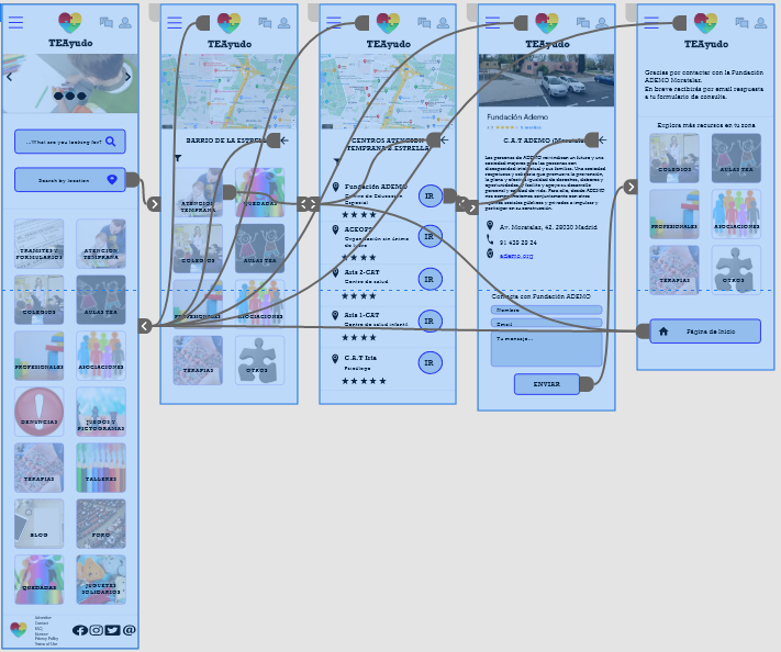
As part of the main user flow, I designed all the screens related to find a resource using the map feature. Following the same scheme, the next screens will show the map above the fold and a list of the resources wanted. Call to action button will led the users to the resource they want to see in detail and a contact form to submit. The last screen will show a message so the user knows that the action has been made, and more resources related to the initial search.
All these screens will have images and common buttons/icons so the users can identify easily what to do with any of them.
https://www.figma.com/file/5e1TK9IKs6IbArGRoFSlFm/Untitled?node-id=0%3A1


Refining the design
I conducted an unmoderated usability study using the low fidelity prototype in Figma and the user flow shown above, with 5 participants testing the prototype remotely.
Thanks to this usability study, I found out crucial improvements that will make the app more accessible and user friendly.
-Help: most of the participants wanted a help button in case they feel lost.
-Sign up: participants said that they were tired of having to sign up before they get to know an app/website.
I identified them as crucial pain points for the users, so I designed the mockups with all this information in mind. Based on the insights from the usability study, I made changes when designing mockups, such as change the message icon to be the chatbot to help the user with the navigation, and avoid the idea of creating a sign up/log in screen at first, so the user may have the option to decide first and then can go straight to the profile icon.
Accessibility considerations:
-Full screen option to images dedicated to work with children, so they can see what the image is about clearly.
-Multiple audio options when working with the resources, as the children also need to hear some of the resources. Caption needed when the resource is a video.
-Chatbot with voice command so the user may use it on the go.
-Languages option, as found in the usability study.
The mobile website keep the search bar as main action, but with the web description first and the carusel with news. The desktop design has the same information resized and a vertical nav bar with all the resources easy to find.
The responsive design is focused on giving the information wanted more than visual elements. The use case focus in users searching for precise information or external links to the procedure, that´s why information is above images.
Conclusions
I would love to take one more usability study with the high fidelity prototype to find out if the UI used works for every participant and make more improvements if needed.
Also I would like to run another user research based on professionals willing to join the community and work with us (as a job platform).
And of course, increase the resources offered, because there are still lots of information to include and this product will need continuous updates.
I am specially proud of this project. I had the opportunity to develop something that I had in my mind for a long time. I am sure that it will be really helpful to a lot of people out there. Hopefully one day all this project will launch and I will be glad to have helped someone out there.
I wont give up and I will improve this design as much as I can to make it real; product like this one must be developed to make a more inclusive society.
“Let no one be left behind”


